Logo Design · Brand Identity · Business Card Design
Gazda Dental is a dental clinic founded and run by two sisters. The project focused on creating a professional and distinctive logo that reflected the clinic’s approach while conveying cleanliness, trust and modernity. As the clients initially had no clearly defined visual direction, I explored several concepts to help them identify the style that best represented their vision.
LOGO CONCEPT & DESIGN
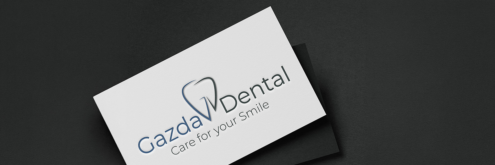
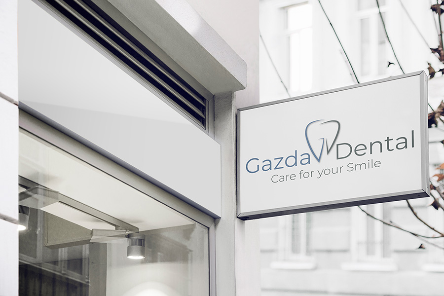
The final concept combined the initials «G» and «D» into a stylised tooth symbol, creating a direct visual connection to the dental profession while keeping the design simple and memorable. A cool colour palette reinforced a clean, calm and professional impression, while modern sans-serif typography complemented the minimalist aesthetic.
BUSINESS CARD DESIGN
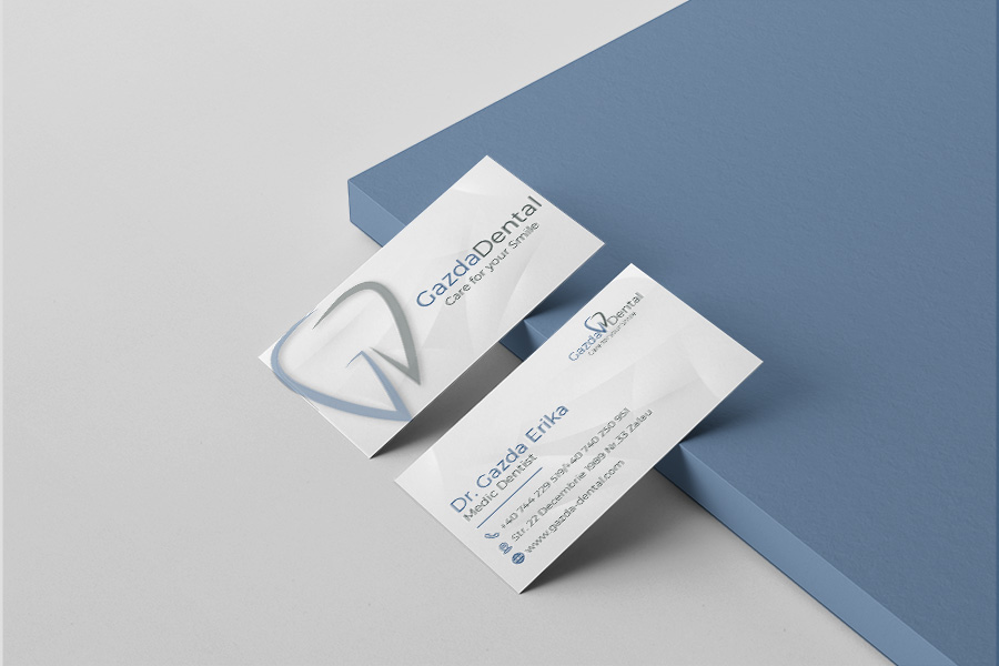
To extend the visual identity into print, I designed minimalist business cards that carried the logo’s visual language into the clinic’s everyday communication. An enlarged watermark and angular graphic details added a distinctive touch while maintaining a clean, balanced layout.
“Working with Fru was easy and pleasant. She guided us through the whole process with patience and enthusiasm, delivering a fantastic final result. We are more than thankful for her great work.” — Erika Gazda & Csilla Gazda, Gazda Dental
My roleLogo Design · Concept Development · Colour Palette · Business Card Design